
Customer Segmentation
Segmenting the customer based to increase retention and frequency

This article is part of the Practical Growth Hacks series, where we are going to explore the following topics:
- Coding Skills:
- Essential Growth Metrics & Models:
Customer Segmentation (You are here)
Customer Activation Strategy
Customer Churn Prediction
Customer LTV Prediction
Booking/Transaction Prediction
AB Testing & Sample Selection
Recommendation Engine
Marketing Mix Model
Market Basket Analysis

If you were following the previous posts, we have built a database on our own MySQL server, then we started to view the core metrics. Now it’s time to segment our customers.
To explain the concept a bit, there are multiple ways of segmenting customers. It all depends on your goal, which should ideally be your North Star Metric (NSM).
Many startups and even founders are unsure about their NSM. Most startups I am in touch with still think their ultimate metric is Revenue. Selecting revenue as your NSM is not a show-stopper, but it is not ideal. An ideal NSM should reflect the point at which customers realize the value you are bringing. Moreover, if your NSM increases, your company should grow with it. It means it should lead to revenue. That’s why we will go after the number of bookings. If the number of bookings increases, it means the customer gets more value, and the revenue increases with it as well.
So, how do we segment our customers based on the number of bookings they make?
Before we go into data work, I should mention the usual reminder here again:
To get the most out of this post, if you haven’t already, go this article, download the dataset I’ve created geniunely for you and build the database on your local machine.
Exploratory Data Analysis
Before we dive into details and define our segments, we should explore our data. So, keep your Jupyter Notebooks ready. We will start with importing the libraries we need, as usual:
import pandas as pd
import numpy as np
import datetime
and the libraries we need to create charts:
import chart_studio.plotly as py
import plotly.offline as pyoff
import plotly.graph_objs as go

#initiate visualization library for jupyter notebook
pyoff.init_notebook_mode()
Now, let’s connect to our database:
import pymysql

host = "localhost"
user = "root" #your username if you have changed it
password = "YOUR PASSWORD"
database="analytics" #your db name if you have changed it

conn = pymysql.connect(host=host, user=user, password=password, charset='utf8', db=database)
cur = conn.cursor()
and we have defined a function to fetch data from the DB and create a Pandas dataframe with the result dataset:
def fetch_data(query):
    cur.execute(query)
    df = pd.DataFrame(cur.fetchall())
    df.columns = [desc[0] for desc in cur.description]
    return df
We are going to build our query now, let’s do it then I’ll explain it extensively:
query = """
with dates as (
    select distinct created_at as obs_date from bookings
    where created_at in
        (select
            max(created_at)
            from bookings
            where created_at < '2023-01-01'
            group by month(created_at),year(created_at)


        )
)


select t1.*,
case when t1.min_booking_date between t1.obs_date - interval 30 day and t1.obs_date - interval 1 day then 1 else 0 end as is_new,
DATEDIFF(t1.obs_date - interval 30 day,max_booking_date) as inactivity

from (

select dt.obs_date,
bt.user_id,
min(bt.created_at) as min_booking_date,
max(case when bt.created_at < dt.obs_date - interval 30 day then bt.created_at else null end) as max_booking_date,
count(case when bt.created_at between dt.obs_date - interval 30 day and dt.obs_date - interval 1 day then bt.id else null end) as booking_30,
count(case when bt.created_at between dt.obs_date - interval 60 day and dt.obs_date - interval 31 day then bt.id else null end) as booking_30_60,
count(case when bt.created_at between dt.obs_date - interval 90 day and dt.obs_date - interval 61 day then bt.id else null end) as booking_60_90,
count(case when bt.created_at < dt.obs_date - interval 90 day then bt.id else null end) as booking_90_plus,
count(bt.id) as booking_lt,

sum(case when bt.created_at between dt.obs_date - interval 30 day and dt.obs_date - interval 1 day then bt.gmv else 0 end) as gmv_30,
sum(bt.gmv) as gmv_lt


from dates as dt
inner join (
    select b.id, b.created_at, b.user_id, b.gmv,
    s.status from
    bookings as b
    inner join booking_status as s on s.id = b.status_id and s.status = 'Completed'
) as bt on bt.created_at < dt.obs_date

group by 1,2
) as t1

"""
The key points of this query are:
1- First, we created a date array. We want to see our data for every last date of all months before Jan ‘23. Then, we will calculate our numbers based on a 30-day rolling window.
2- Then, with the line starting with select dt.obs_date, we started to calculate our numbers:
min_booking_date: we need this field to see if the user is a new user or an existing user. (New user means a user who made their first booking in the 30-day window that we are observing; Existing users should have bookings earlier)
max_booking_date: we calculate this to find out the number of inactive days of the users. The formula for inactivity is observation date - max_booking_date
booking_x_x: in this group of fields, we calculate the booking count per user in different windows, like 0-30, 30-60, etc. 0-30 is mostly for calculating the booking frequency of the user. Windows with older days will show us the retention of the users. We have to calculate retention because there should be a clear retention difference between the segments we are going to define. The last reason for calculating them is to further segment our users, such as Retained or Reactivated.
gmv_x: GMV-related fields will be calculated only to analyze the difference in monetary level between the segments.
Finally, we will calculate these numbers based on Completed bookings.
3—The final part is where we calculate inactivity and whether a user is a new user with the part with selected t1.*….
Let’s fetch the results:
segment_df = fetch_data(query)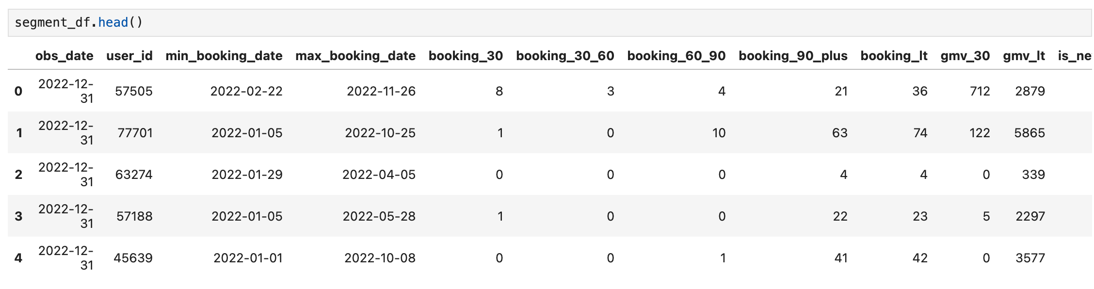
It looks good. We can continue analyzing the numbers. First, we will create a dataframe that only contains the Active Users (users with a booking in 30 days):
active_df = segment_df[segment_df.booking_30>0].reset_index(drop=True)Now, let’s use the .describe() function to see how our users’ 30 day bookings look like:
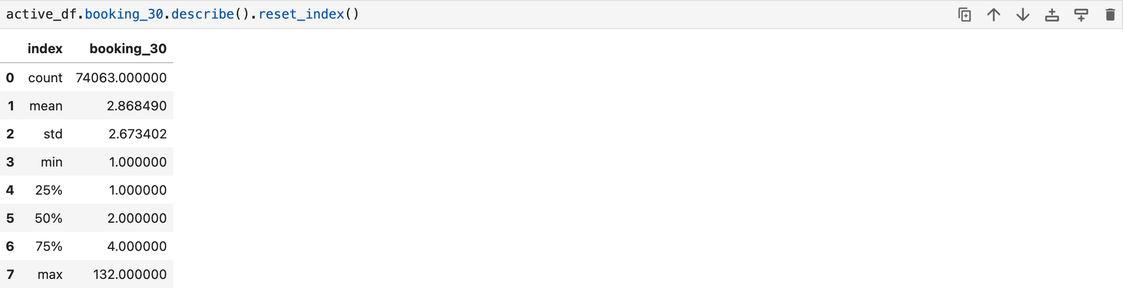
This gives a clear picture of booking frequency. The average is 2.87, while the median stands at 2. Maximum is 132 (probably it is the founder/CEO of the company :)
Let’s make it more visual, and see the number of bookings and users in a histogram:
plot_data = [
    go.Histogram(
        x=active_df['booking_30'],
    )
]

plot_layout = go.Layout(
        title='Frequency',
        height=600
    )
fig = go.Figure(data=plot_data, layout=plot_layout)
pyoff.iplot(fig)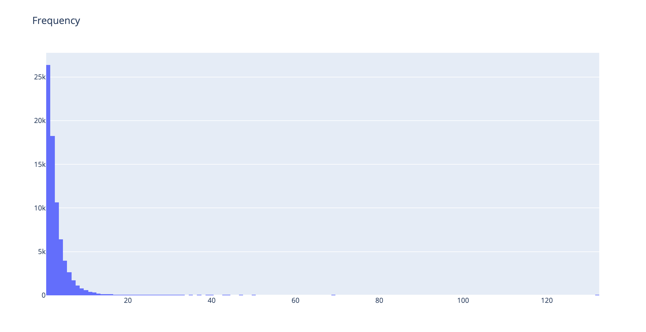
The biggest chunk of users is only making one booking. And we see a decreasing trend as expected.
We can just get rid of the outliers by using the .quantile() function like below (we will eliminate users that are beyond 99th percentile):
plot_data = [
    go.Histogram(
        x=active_df[active_df.booking_30 < active_df.booking_30.quantile(0.99)]['booking_30'],
    )
]

plot_layout = go.Layout(
        title='Frequency',
        height=600
    )
fig = go.Figure(data=plot_data, layout=plot_layout)
pyoff.iplot(fig)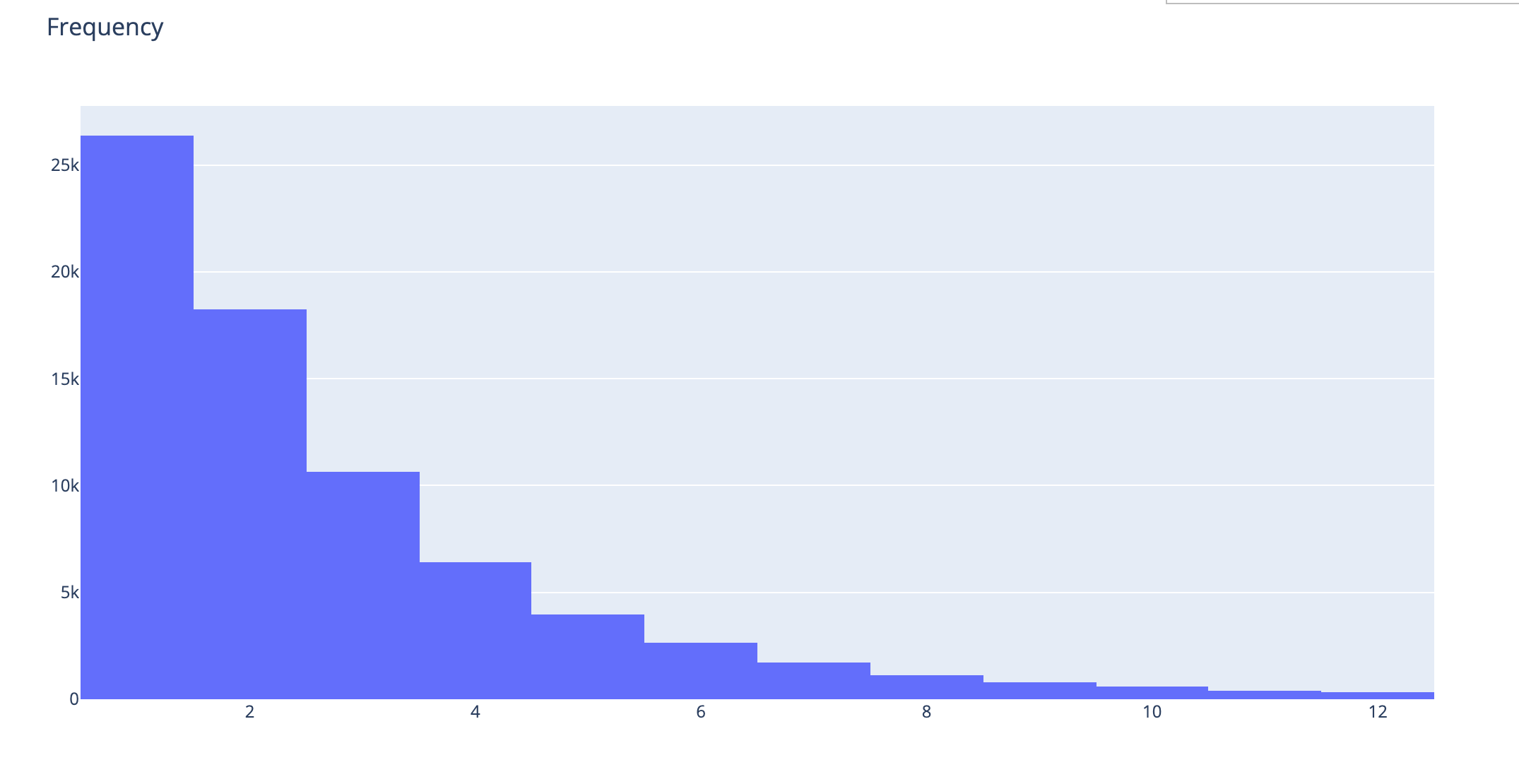
Now, how do we decide what cut-off we should use to segment customers? To do that, we should refer to the King of All Metrics: Retention. We have created a different data frame for that. We will create one with users who have booking_30_60 greater than 1. And we will see how many of them have a booking in the 0_30 window:
active_60_df= segment_df[segment_df.booking_30_60>0].reset_index(drop=True)

active_60_df['retained'] = 0
active_60_df.loc[active_60_df.booking_30 > 0, 'retained'] = 1
The dataframe above now has all the active users in a 30-60 window and a field called retained to tell us if that particular user has retained it. Now, we will create another dataframe to use in our retention by frequency chart. That chart will show us the retention of the users based on how many bookings they have made.
ret_by_freq = active_60_df.groupby('booking_30_60').retained.mean().reset_index()

ret_by_freq['retained'] = np.round(ret_by_freq['retained'],3)
Now, we have the Retention Rate based on the number of bookings the users make. Let’s plot it:
plot_data = [
    go.Bar(
        x=ret_by_freq['booking_30_60'],
        y=ret_by_freq['retained'],
        text=ret_by_freq['retained'].astype(str),
    )
]

plot_layout = go.Layout(
        xaxis={"type": "category"},
        title='Retention by Frequency',
        height=600

    )
fig = go.Figure(data=plot_data, layout=plot_layout)
pyoff.iplot(fig)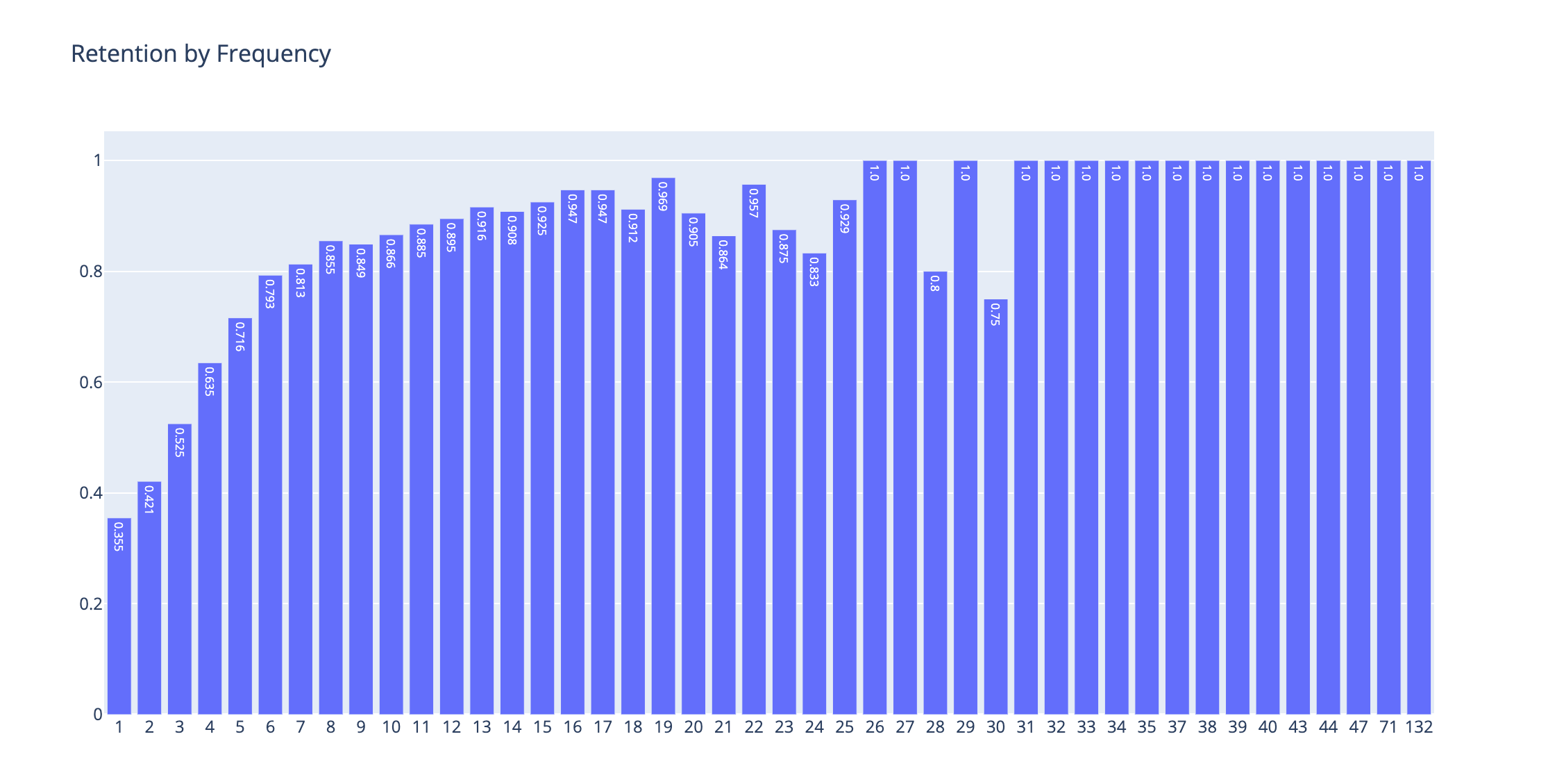
This is a wonderful picture. We can see what booking cut-offs are changing user behavior and show the signs of whether a user will retain next month or not.
Frequency Segment
As you can see, there is more than a 10pp difference in bookings between the 2nd and 3rd booking. This is a great candidate for our first segment cut-off.
The last big cut-off is between the 5th and 6th booking, which is around 8pp.
After the 6th booking, it still gradually increases, there are some discrepancies in the trend after some point. However, this is due to the very low sample sizes. We can use the user share in terms percentage by running the code below:
users_by_freq = active_60_df.groupby('booking_30_60').user_id.nunique().reset_index()

users_by_freq['user_share'] = np.round(users_by_freq['user_id']/users_by_freq['user_id'].sum(),2)
and plot it:
plot_df = users_by_freq[users_by_freq.booking_30_60<20]
plot_data = [
    go.Bar(
        x=plot_df['booking_30_60'],
        y=plot_df['user_share'],
        text=plot_df['user_share'].astype(str),
    )
]

plot_layout = go.Layout(
        xaxis={"type": "category"},
        title='User Share by Frequency',
        height=600

    )
fig = go.Figure(data=plot_data, layout=plot_layout)
pyoff.iplot(fig)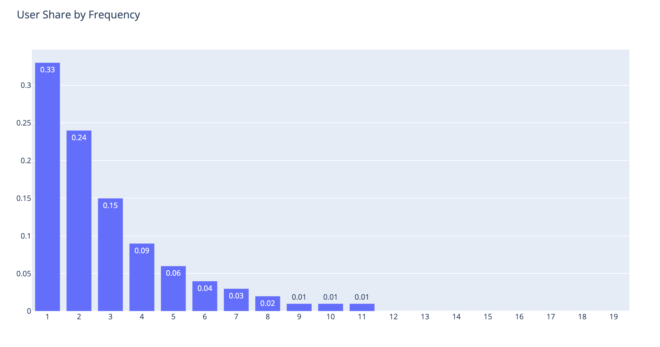
As you can see above, considering the thresholds I mentioned earlier, this is the user distribution:
1-2 Bookings: 57%
3-5 Bookings: 30%
6+ Bookings: 13%
We will name them as Low Value, Mid Value, and High Value users, respectively.
Let’s check the retention rate of these buckets one by one:
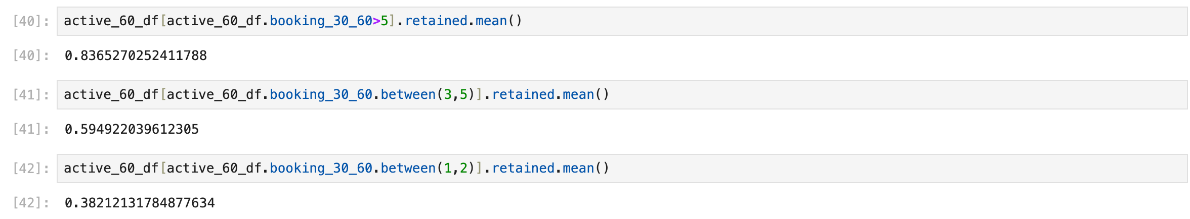
This is exactly what we wanted to do. Now, we have 3 frequency segments, and they are quite distinctive based on their retention rates. Let’s do some data work, add our segment names to the dataframes, and visualize them:
segment_df['frequency_segment'] = 'None'
segment_df.loc[segment_df.booking_30 > 0,'frequency_segment'] = 'LV'
segment_df.loc[segment_df.booking_30 >= 3,'frequency_segment'] = 'MV'
segment_df.loc[segment_df.booking_30 >= 5,'frequency_segment'] = 'HV'

segment_df['frequency_segment_30_60'] = 'None'
segment_df.loc[segment_df.booking_30_60 > 0,'frequency_segment_30_60'] = 'LV'
segment_df.loc[segment_df.booking_30_60 >= 3,'frequency_segment_30_60'] = 'MV'
segment_df.loc[segment_df.booking_30_60 >= 5,'frequency_segment_30_60'] = 'HV'
To calculate the retention rate inside the dataframe based on these segments, we should do the following:
m1_active_df = segment_df[(segment_df.booking_30>0) & (segment_df.booking_30_60>0)].groupby(['obs_date','frequency_segment_30_60']).user_id.nunique().reset_index()

m2_active_df = segment_df[segment_df.booking_30_60>0].groupby(['obs_date','frequency_segment_30_60']).user_id.nunique().reset_index()

retention_df= pd.merge(m1_active_df,m2_active_df,on=['obs_date','frequency_segment_30_60'])
retention_df.columns = ['obs_date','frequency_segment_30_60','retained_users','m2_active_users']

retention_df['retention_rate'] = np.round(retention_df['retained_users']/retention_df['m2_active_users'],3)
Let’s see what our retention dataframe looks like:
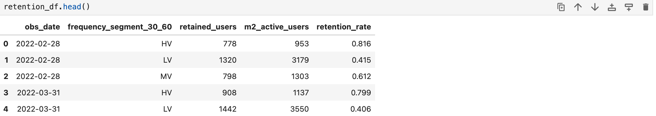
Excellent. Per observation date and segment, we have the retention rate and we can visualize them historically.
plot_df = pd.pivot_table(retention_df, values='retention_rate', index=['obs_date'],columns='frequency_segment_30_60', aggfunc=np.sum)


fig = go.Figure()

for col in plot_df.columns:
    fig.add_trace(go.Scatter(x=plot_df.index, y=plot_df[col].values,text=plot_df[col],
                             name = col,
                             mode = 'markers+lines+text',
                             line=dict(shape='linear'),
                             connectgaps=True
                             )
                 )
fig.update_layout(
        xaxis={"type": "category"},
        title='Retention - by frequency segment',
        height=600
    )
fig.update_traces(textposition='top center')

fig.show()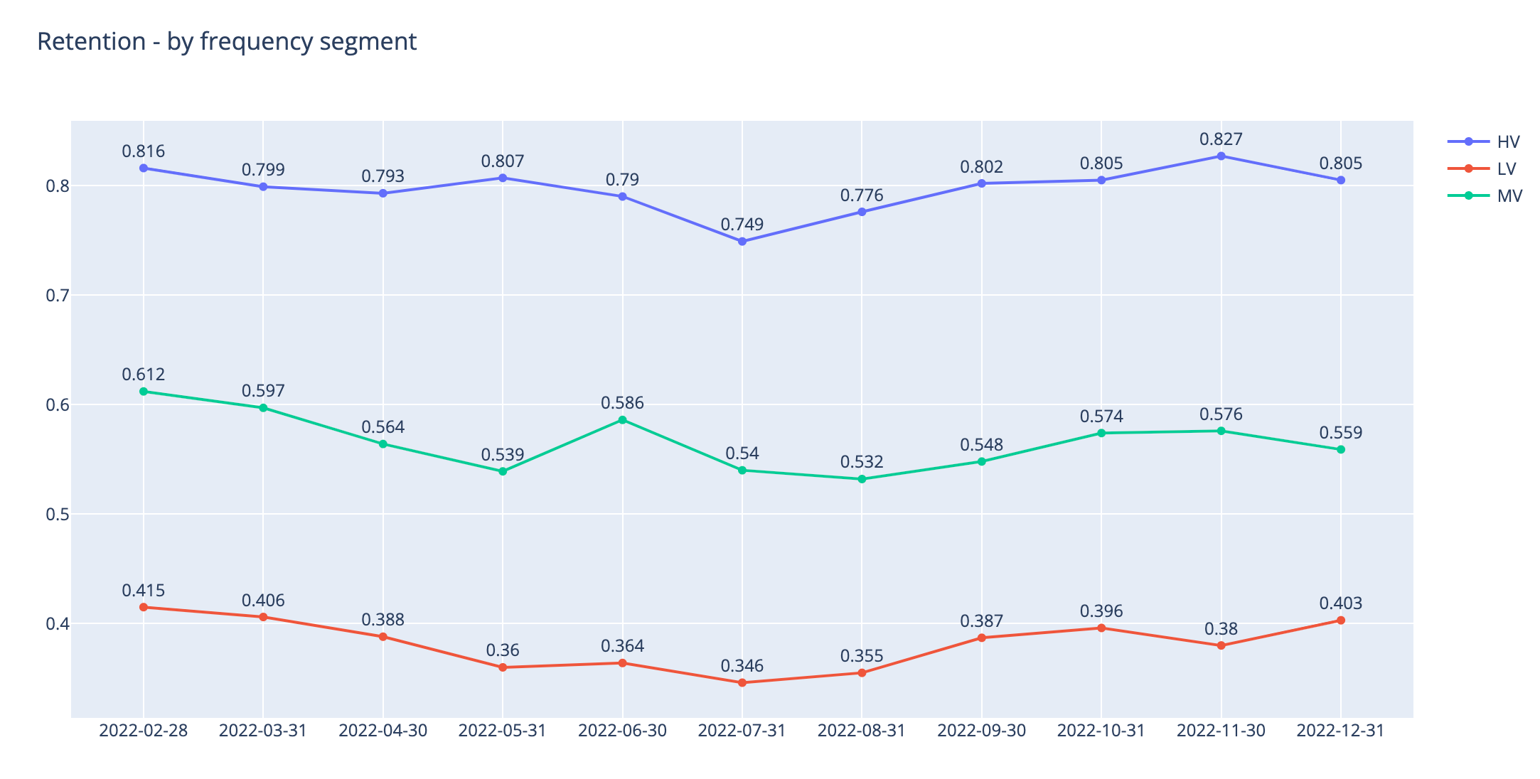
You can see how our higher segments are performing much better in terms of 30-day retention.
The next stop will be calculating the inactivity segments. Reactivating our users who have been inactive for more than 30 days will be another growth hack that we should do regularly.
A simple use case for this segmentation is, users who are moving from MV to LV shows clear indications of churn. So marketing teams can double down on their efforts for this group and maybe use difference pricing/promotion strategies.
